I have become familiar with the new remote in OpenLP 3.x . It seems to be working very well, but there are some issues with the layout.
The biggest issue for me is in Stage view,
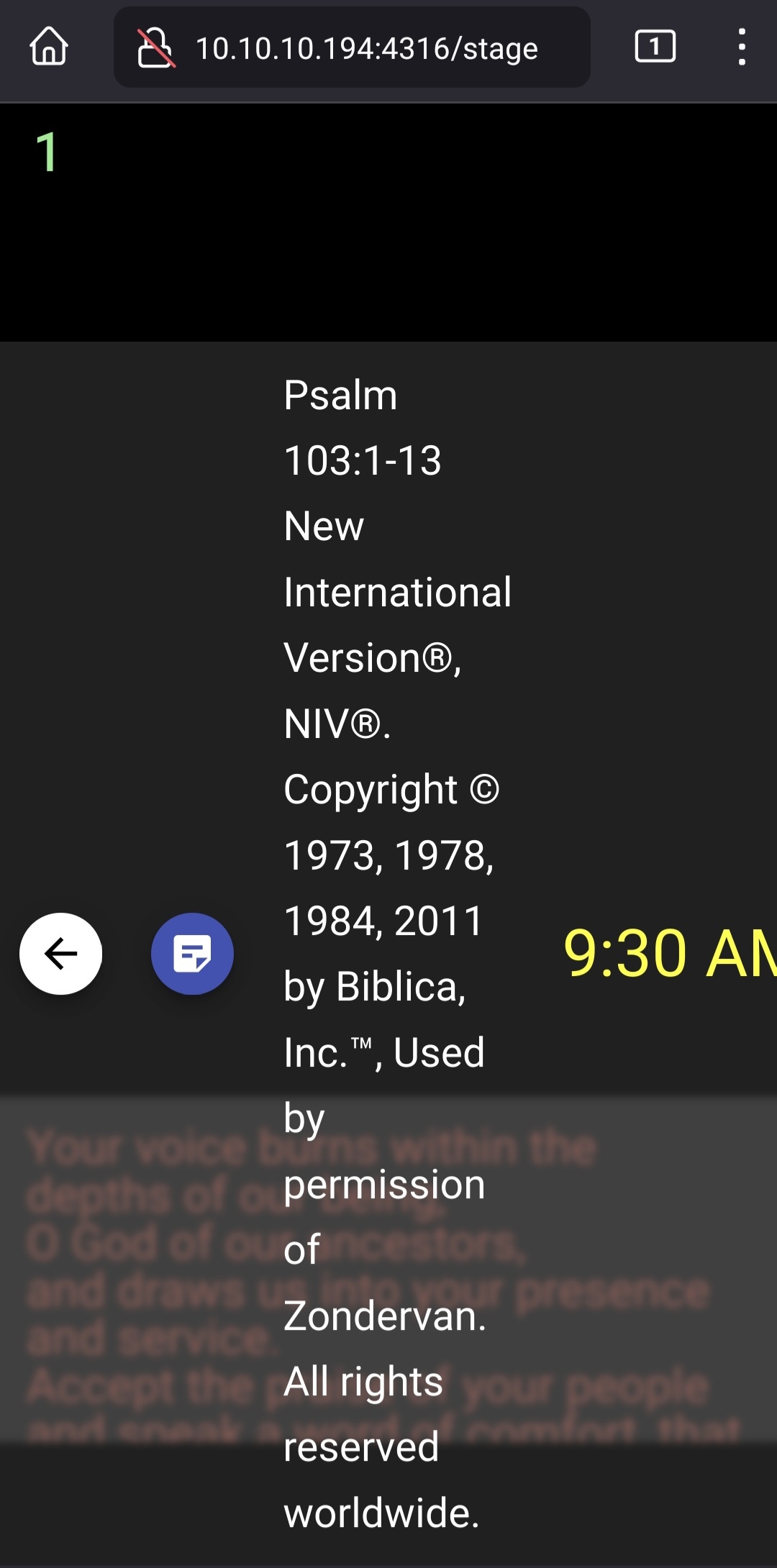
The info about the next item in the service shows at the bottom of the browser and overlays the notes.
I often have notes to guide through the service, and it is important to see what is coming next for a smooth transition.
I would prefer the notes in a sized block at the top of the screen so that I can scroll through the notes. Then have the slide contents in the middle, with a small block at the bottom with what is coming next.
There are also issue with the slide view staying focused on the live slide and being able to see notes in the slide view.
Thanks again for OpenLP. It is a wonderful gift to the Kingdom,
Fred
Comments
A quick update. After some testing I find that the layout I was using was with a tablet in portrait orientation. If the browser window changes dimensions, then the elements on the screen change to different locations.
I will need to see what works best for us.
Again thanks...
Fred
The notes remain problematic when the information for the next slide is very long. For example, when the next slide is a scripture, the scripture reference PLUS ALL THE COPYRIGHT INFORMATION is shown and this then covers up the notes. Maybe the next slide info can be truncated?
Even with all the comments, I fine OpenLP a great tool. We use it with OBS to record and stream services very effectively at a very low cost.
Fred
Hey Fred, can you upload a screenshot of the problem? As the saying goes, a picture is worth a thousand words. Thanks!
Here is one example from an android phone. My tablet is not as extreme, but still hard to use. In landscape the tablet is sometimes usable.
This was a blank slide with notes for the leader and a Bible passage to follow with the complete copyright info for the Bible.
Fred